

Smart Sparrow is a small company focused on educational
software.
I had landed a contract specifically to help them build
a new version of their online chemistry labs, to be used
by Arizona State and Oregon State Universities for the
online portion of their curriculum. The respective
universities' online chem labs had looked dated and
had a limited, somewhat unintuitive implementation,
built on Microsoft Silverlight.
Solution was a web-based interface built from ground-up,
in which students were provided with a digital experience
of chemistry labs that allows for sandbox behavior.
Designed for tablets & desktop.
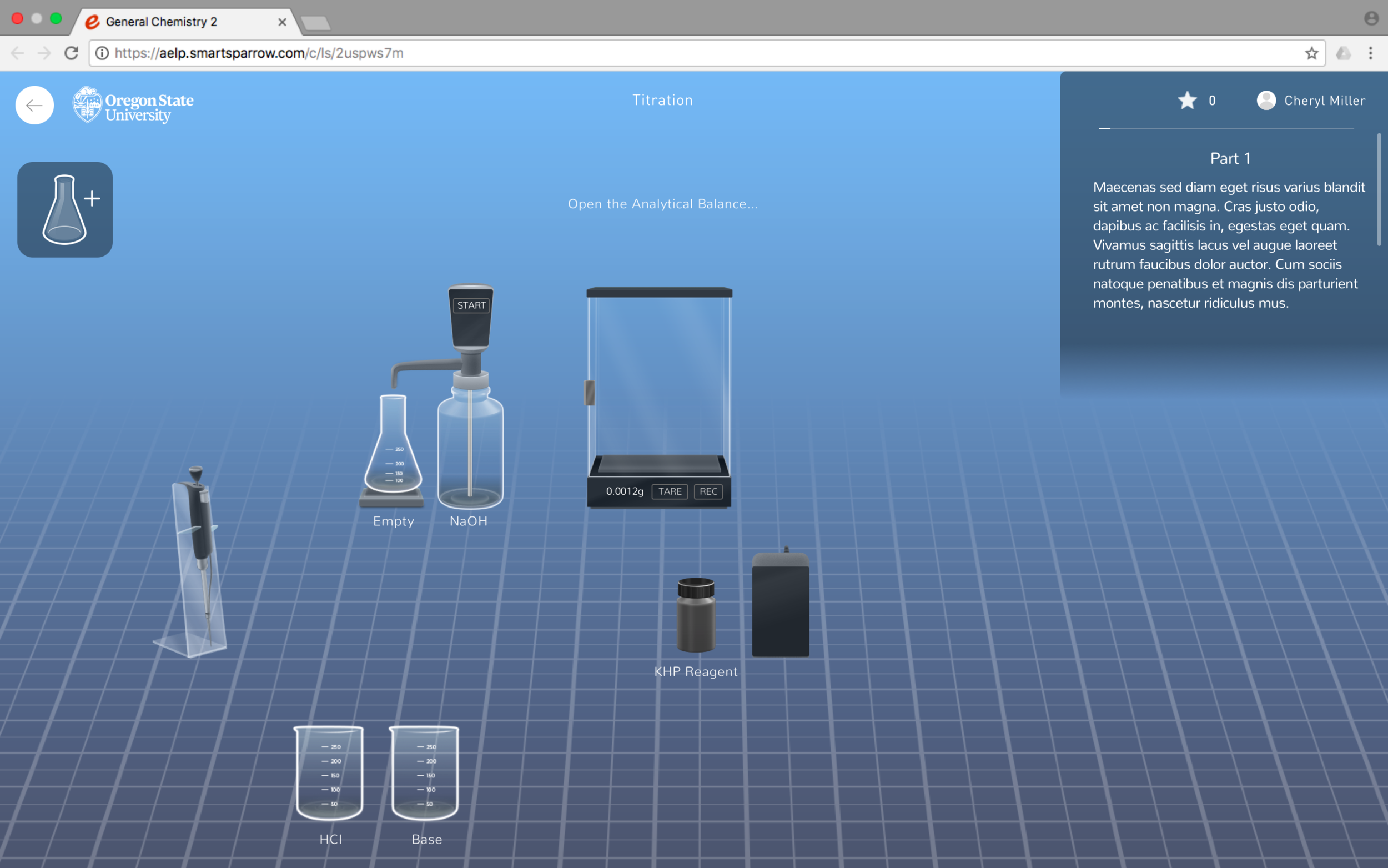
Final design with multiple rows with varying zoom to maximize workspace without breaking perspective.
During research, much of the existing experiences that
shared similarities had the aesthetic of the era they
were built in. I've researched many accessible online
chemistry labs to understand that production of such
tools is a rarity.
After some explorations,
it was decided that a style between illustrative and
realistic would make the experience look polished and
there would be fewest opportunities for students
to misunderstand, as they will be expected to follow
up with their digital experiences in an actual lab with
real equipment. They had to know exactly what to look for, so
most things had to be very accurate.
As far as interaction, I alluded to the simplest,
most intuitive interaction models that are accessible
to the widest general audience.
The closest analog I could draw to interacting between
different objects were 90's Lucasfilm games, where users
would pick objects out of their inventory and combine
them as necessary to solve puzzles, and perfectly suited
for touch interfaces.

1993's Sam & Max: Hit the Road

Tools in final scale. Click on image to view Tool Breakdown PDF.
Initially it was important to test out the interaction
before delving deep into everything else.
There were about fifty tools that had yet to be built
in various forms and complexities. The workspace had
to be modular and remind the user of an actual lab,
with as many as twenty or more tools that pertained
to a single lab, to be displayed side-by-side. This
also necessitated a positioning grid system the user
could easily navigate. All this had to come together
as an interactive prototype as quickly as possible to
define the functions.

The early prototype had the tile system visible
and focused on the experience in broad strokes
rather than trying to specify the minute details.
What immediately became important was the amount
of detail in the tool assets. We initially wanted
them drawn in SVG, but the team
preferred a more realistic visual style.
SVG is efficient at lines for logos and beyond, but
is not the right format for very detailed highly shaded
graphics, and pushing it would impact the experience's
performance on new machines, making slower machines
downright impossible to pull off in their desired visual
fidelity. From the first asset implementation attempts,
it was agreed-upon that we'd start with PNGs and
potentially convert to SVG if we deem it worth the
extra development time after testing viability more
rigorously: the target devices were small student
laptops.

Despite a clean style, we had to solve the issue of the glassware interacting with the background inconsistently.
Glassware was tricky by itself as it required a consistent scale (which shifted based on how dense the tools were going to be in each lab) as well as liquid levels observable to a similar level of accuracy to a real-life lab. Another problem was the glassware standing out against the background which had to remind users of an environment like they might see at their schools.
The amount of detail necessary to the tools made it unviable to simply adhere to using Sketch, as it is unsuited for such detailed graphics, not to mention the inability of the software to export color-accurate assets.
Apart from glassware, each tool had unique functions, required polished css animations and had to mesh perfectly with everything else. Fortunately most of the functions were unique to several labs, so I quickly shifted from generalized interactive prototypes to specific labs.
Cells on Oculus Rift

Another interesting project lasting a mere couple of weeks was a Oculus Rift powered experience that allowed users to travel inside cells and identify all the different parts with the aid of the controllers.
I was tasked with coming up with the menu UI as well as with designing the in-game controllers. Somewhere there's a photo of zuck showing it off on stage, sadly I lost this photo...haha

In Conclusion...
The Smart Sparrow Online Chem Labs were completed in late December.
The fulfillment I gained from work that went beyond pure commercialism was far more rewarding than my previous roles. Knowing that my efforts helped students access information more easily—even grasp concepts that might have otherwise been challenging—made every moment feel like time well spent.