
Case Studies
Please adjust your browser width for optimal viewing.
You can use your ← / → arrow keys to navigate the case studies.
🔍 Click screens to englarge them.
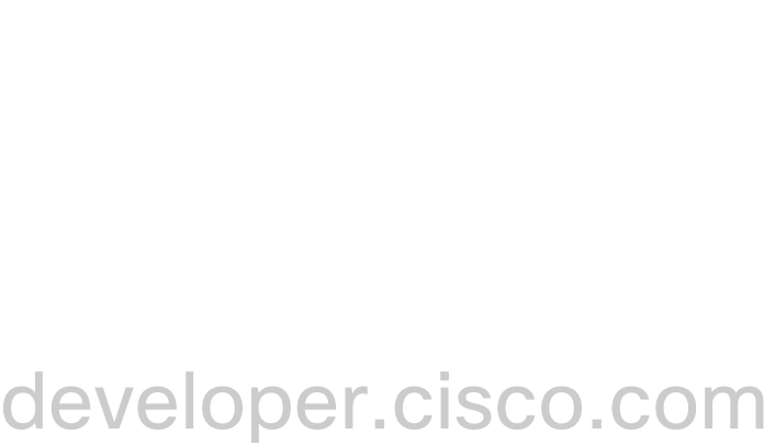 Developer Portal
Ongoing, 2017 - 2024
Discoverability, Unlocked
Developer Portal
Ongoing, 2017 - 2024
Discoverability, UnlockedA smoother navigation system for Cisco's Dev Hub
 Learning 2.0
Ongoing, 2018 - 2020
One LMS to Teach Them All
Learning 2.0
Ongoing, 2018 - 2020
One LMS to Teach Them AllOne hub to find them. One hub to bring them all and in to DevNet bind them
 API Insights
Active development ~ 1.2 years
Measure Twice, Deploy Once
API Insights
Active development ~ 1.2 years
Measure Twice, Deploy OnceAPI Spec quality to help guide development earlier
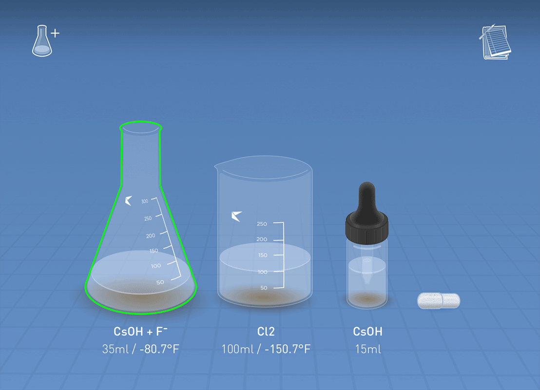
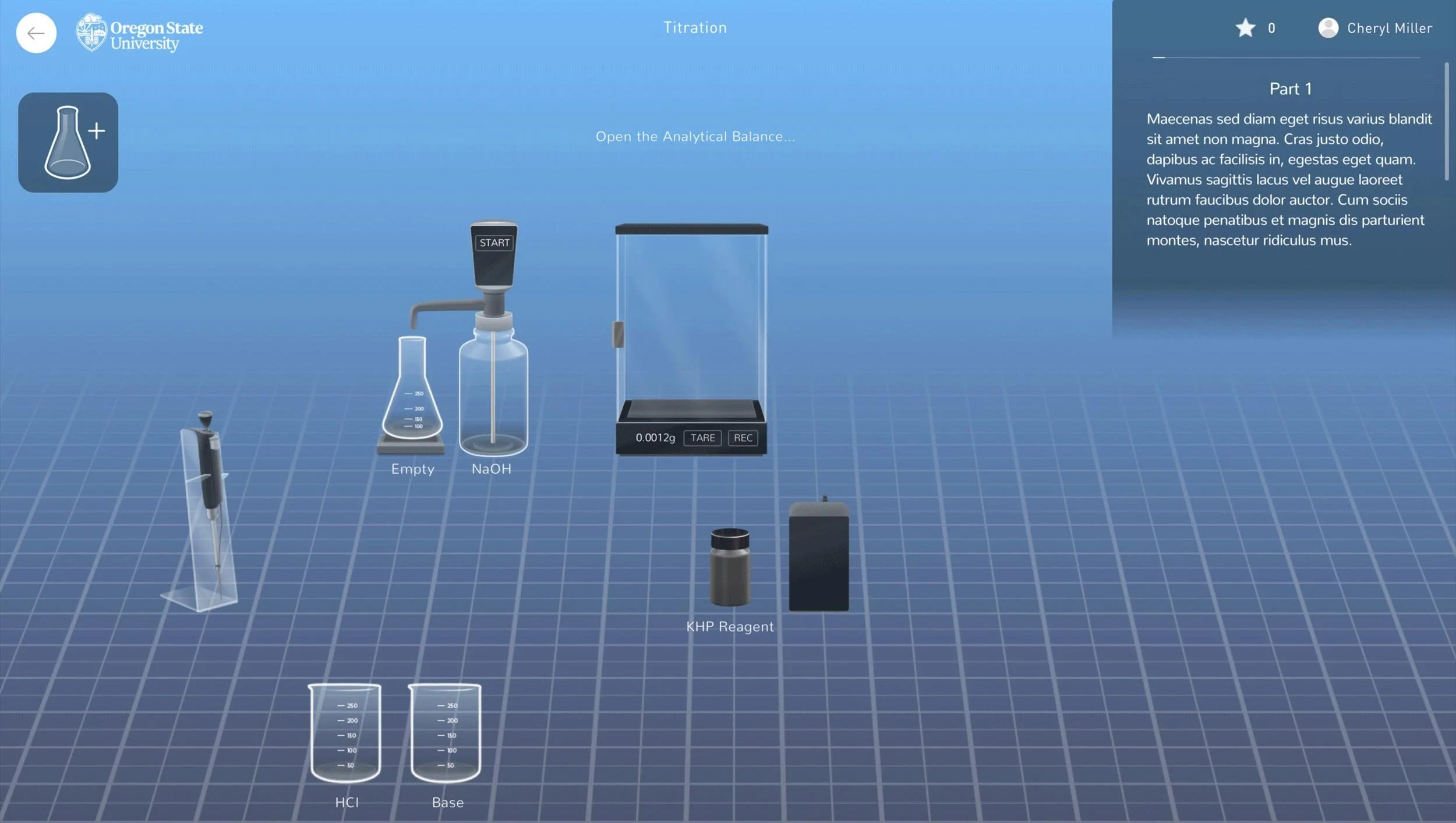
 WetLabs
Online Chemistry Labs
Simulated Science, Real Constraints
WetLabs
Online Chemistry Labs
Simulated Science, Real ConstraintsPerformant, authentic lab experience that runs on everything
 TheFind
2012 - 2015 (Acquired)
From Search to Stickiness
TheFind
2012 - 2015 (Acquired)
From Search to StickinessTraffic-focused product turns into one with user engagement
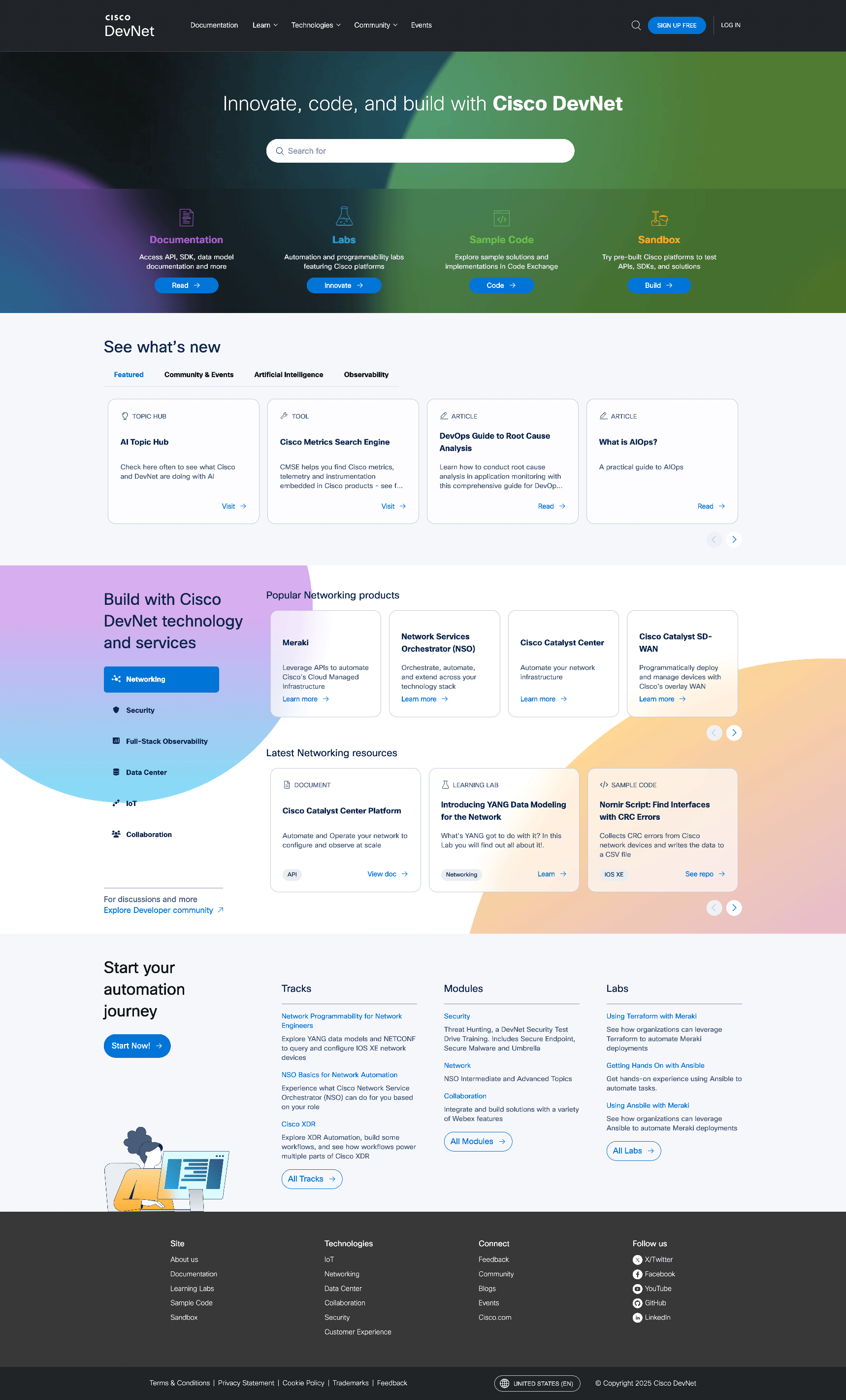
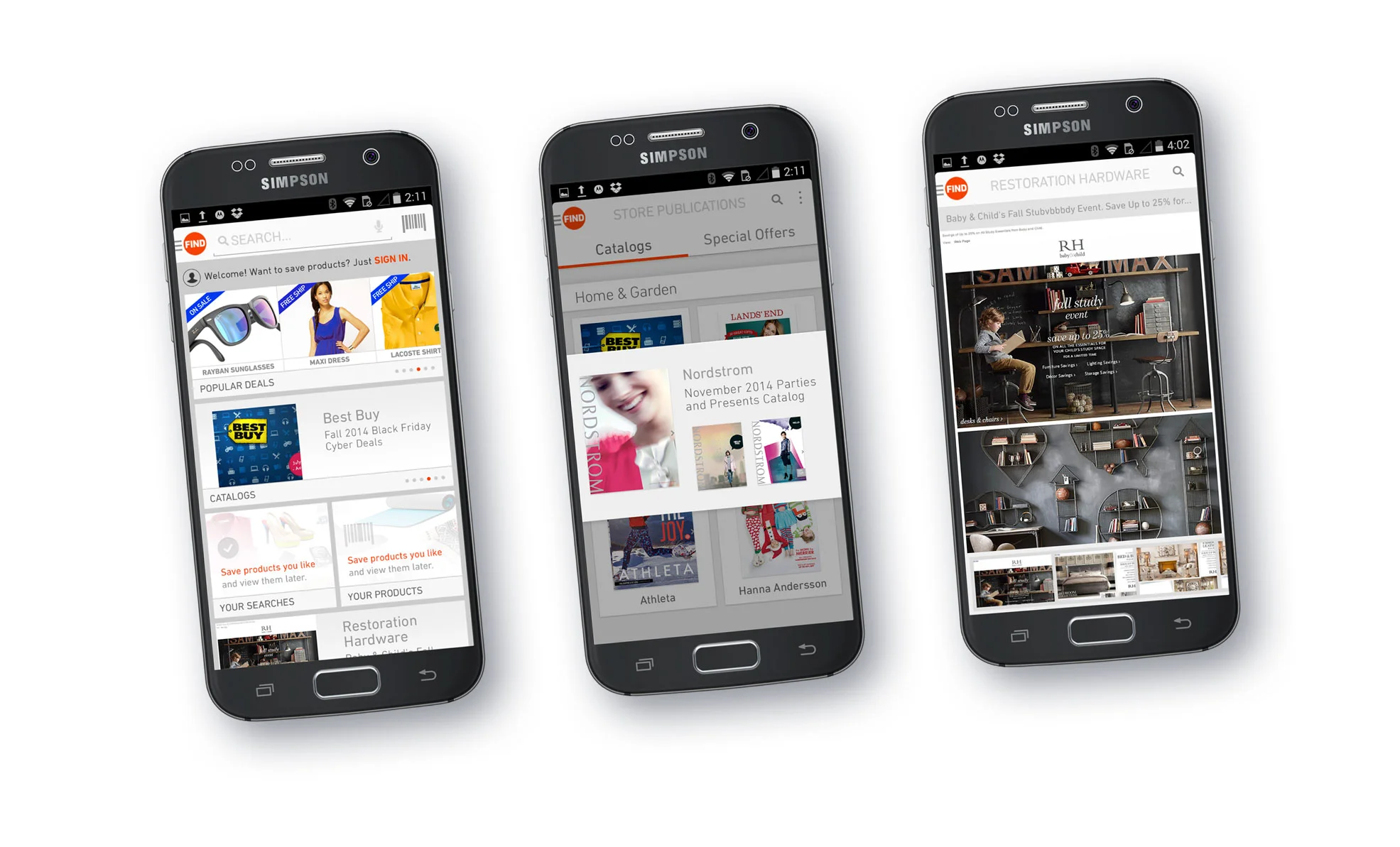
Developer Portal
Ongoing, 2018 - 2024
cisco.com and developer.cisco.com
have different audiences:
corporate and engineers.
but engineers were getting lost.

Problem
"Too much content,
not sure where to start."
This came from both junior and senior devs,
and slowed new adoption of Cisco platforms.
and slowed new adoption of Cisco platforms.
Initial Approach
Launch a Start Now page for newcomers with Learning Paths
newcomers were happy, but- senior devs were still not finding relevant content, so we turned to events feedback, research & analytics to dig deeper.
newcomers were happy, but- senior devs were still not finding relevant content, so we turned to events feedback, research & analytics to dig deeper.
Deeper Insight
Across all sources, everyone seeks:
- 1. Documentation
- 2. Code Samples
- 3. Sandboxes
Long-Term Shift
This shaped our content strategy:
+ new epic: Plan a central docs hub
- Collapse redundant verticals
- Elevate high-demand tools
- Deprecate low-traffic sections
+ new epic: Plan a central docs hub
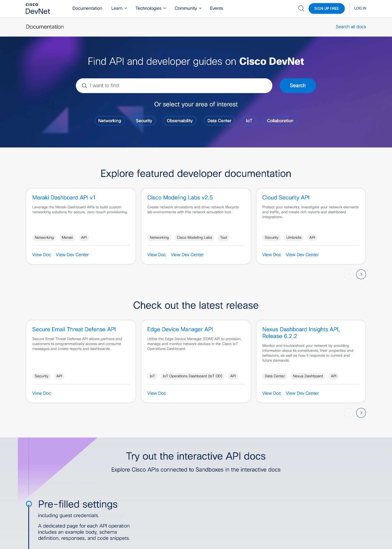
Outcome
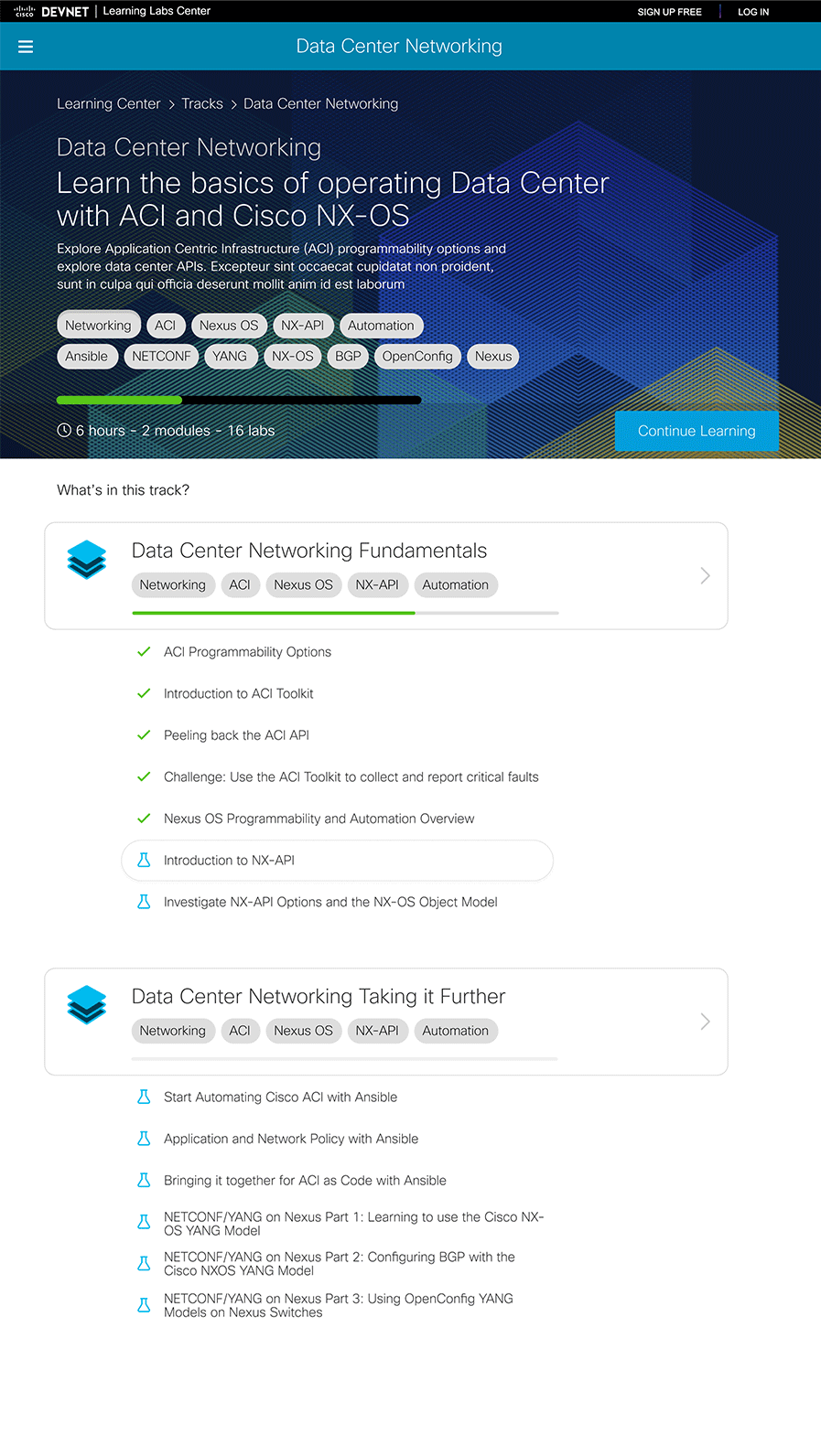
Start Now page became a clear quick-access portal.
The Result: A fast, focused and user-driven developer experience.
- Reduced clutter
- Improved wayfinding
- Omitted corporate messaging
The Result: A fast, focused and user-driven developer experience.
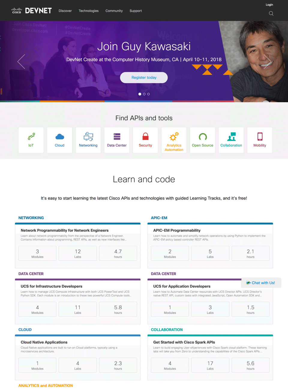
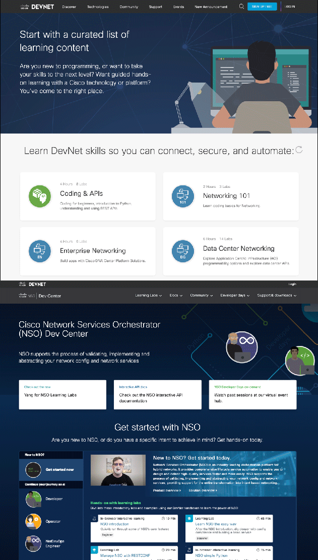
Learning 2.0
Ongoing, 2018–2020
Cisco DevNet had over 1,200 learning labs.
Most were longtail content(Older but still used content.).
All were displayed in inconsistent, disconnected ways.
Most were longtail content(Older but still used content.).
All were displayed in inconsistent, disconnected ways.
Problem
Too much old content, no clear path forward.
Which is current, which is legacy?
No brand cohesion, disconnected UX.
This friction stalled growth and confused users.
KR Approach
Develop content guidelines.
Plot user paths to move between content.
Retain brand continuity.
Plot user paths to move between content.
Retain brand continuity.
Solution
We couldn't leverage Cisco's paid LMS.
So we built our own from scratch.
So we built our own from scratch.
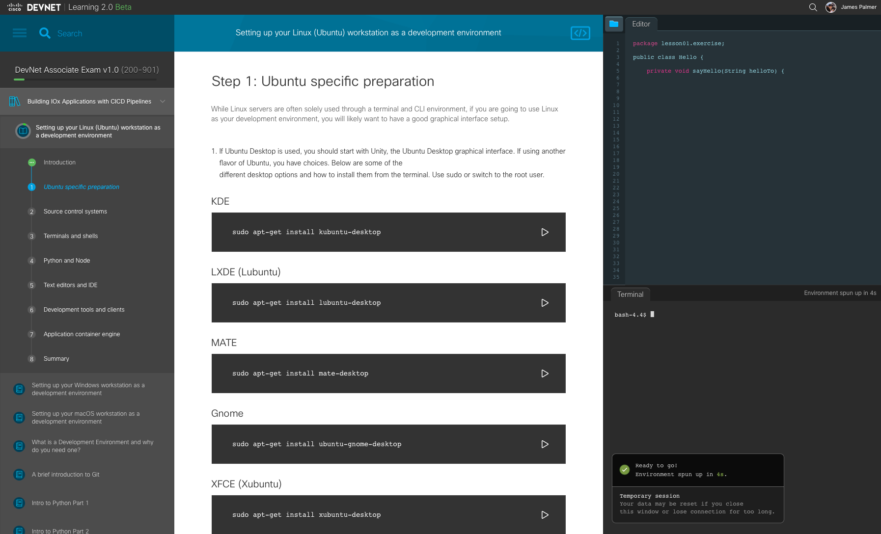
- Responsive desktop-based layout
- Pacing and focus-based UX
- Live editor & terminal
- Quiz scaffolding for certification
Lessons
Scaffolding enables consistency but doesn't enforce it.
Older content doesn't always fit new formats.
Content writers have diverse needs & styles.
But for new certification tracks everything worked perfectly.
Older content doesn't always fit new formats.
Content writers have diverse needs & styles.
But for new certification tracks everything worked perfectly.
Outcome
Longtail and new content now had a common platform.
- A unified, resumable learning experience.
- Aligned to certification journeys and real-world tasks.
- Delivered a consistent, branded UX for all labs.
Longtail and new content now had a common platform.
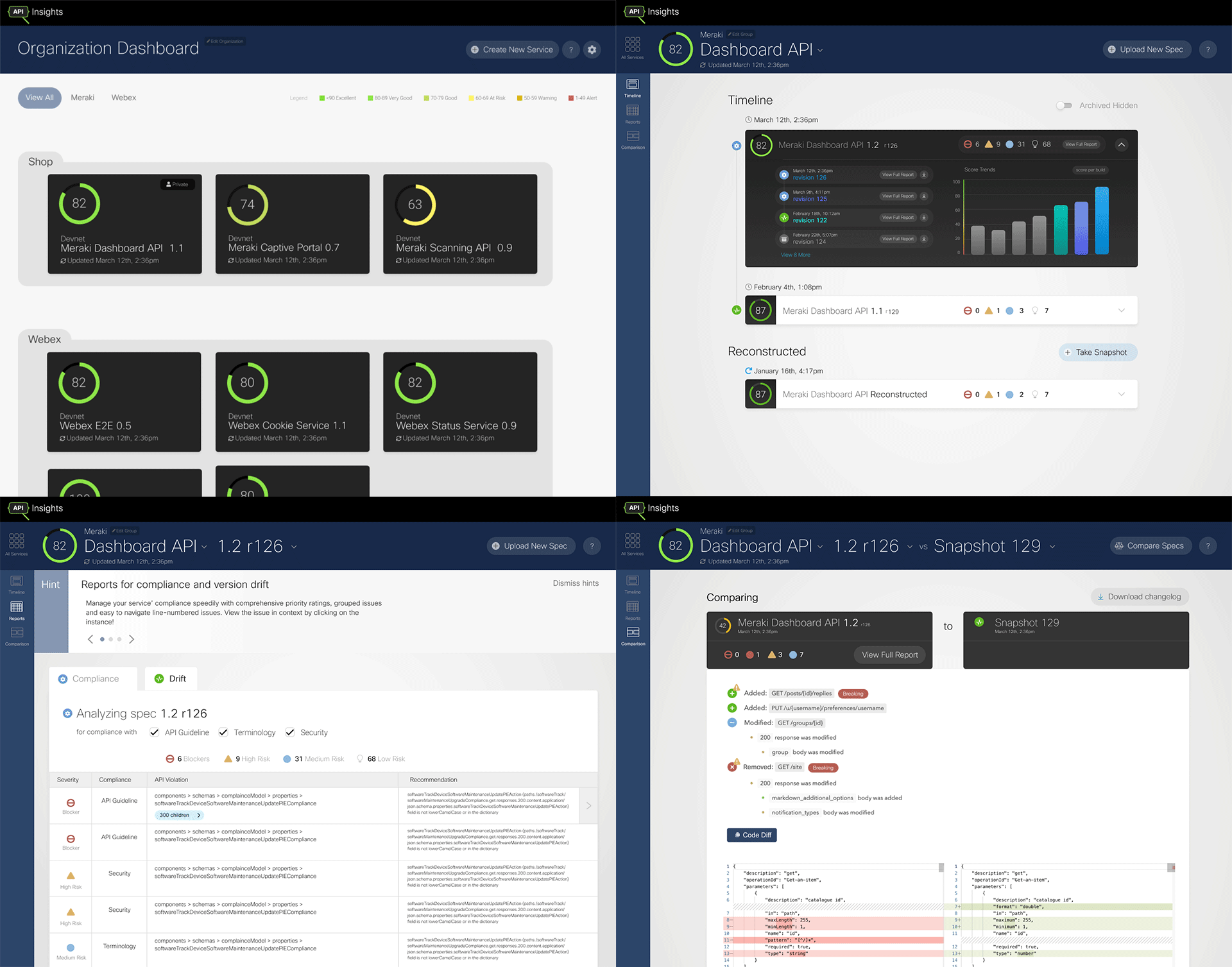
API Insights
Active development ~1.2 years
Dev tool for internal engineers
Hundreds of Cisco engineers wrote APIs.
No unified way to track API quality or compliance.
Requirements were vague.
Hundreds of Cisco engineers wrote APIs.
No unified way to track API quality or compliance.
Requirements were vague.
Problem
- No root visibility into API quality
- No Cisco API standards assurance
- No tool to guide API compliance

Approach
Establish the Foundation
Workshop requirements with engineering
Define use cases core to API development
Build a dashboard-centric flow around real CI/CD habits
Support easy hand-off between engineers
Workshop requirements with engineering
Define use cases core to API development
Build a dashboard-centric flow around real CI/CD habits
Support easy hand-off between engineers
Features
API service group dashboard with Health indicator.
Health tracked over time per version via Timeline.
API spec compliance Reports and recommendations.
Compare two specs side by side to see drift.
Maintain clarity, UX geography and context.
Health tracked over time per version via Timeline.
API spec compliance Reports and recommendations.
Compare two specs side by side to see drift.
Maintain clarity, UX geography and context.
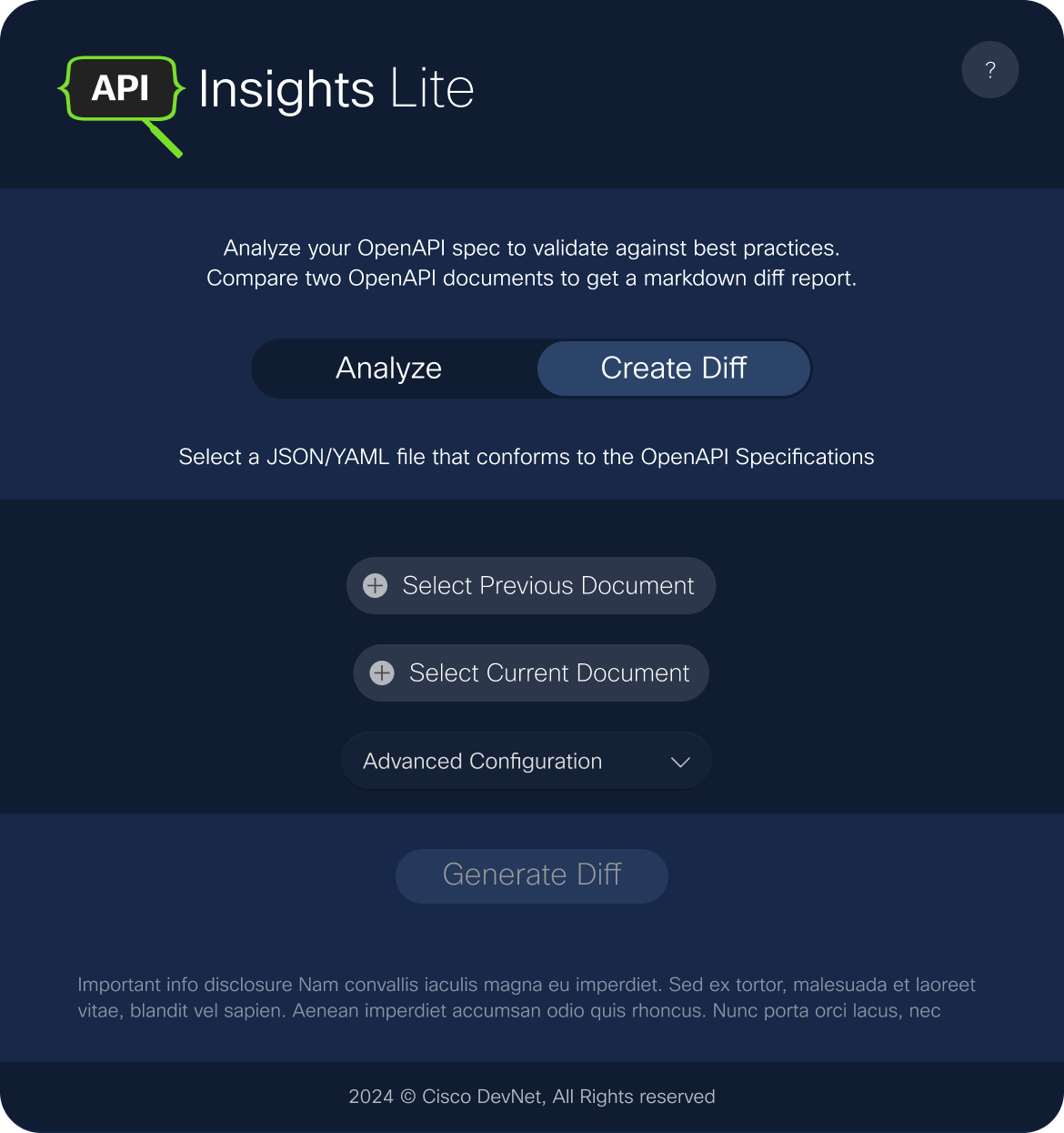
Iteration
Roles: Super user & Limited
Additional service and spec management, improved report formats, state flagging
User-driven contact features and CI/CD hookups
API Insights Lite for quick stateless upload checks
Additional service and spec management, improved report formats, state flagging
User-driven contact features and CI/CD hookups
API Insights Lite for quick stateless upload checks
Outcome
A developer-friendly frontend of a CI/CD pipeline.
- Unified tool adopted by ~800 engineers
- Centralized visibility into API health and compliance
- UI designed for oversight, review and smooth handoff
A developer-friendly frontend of a CI/CD pipeline.
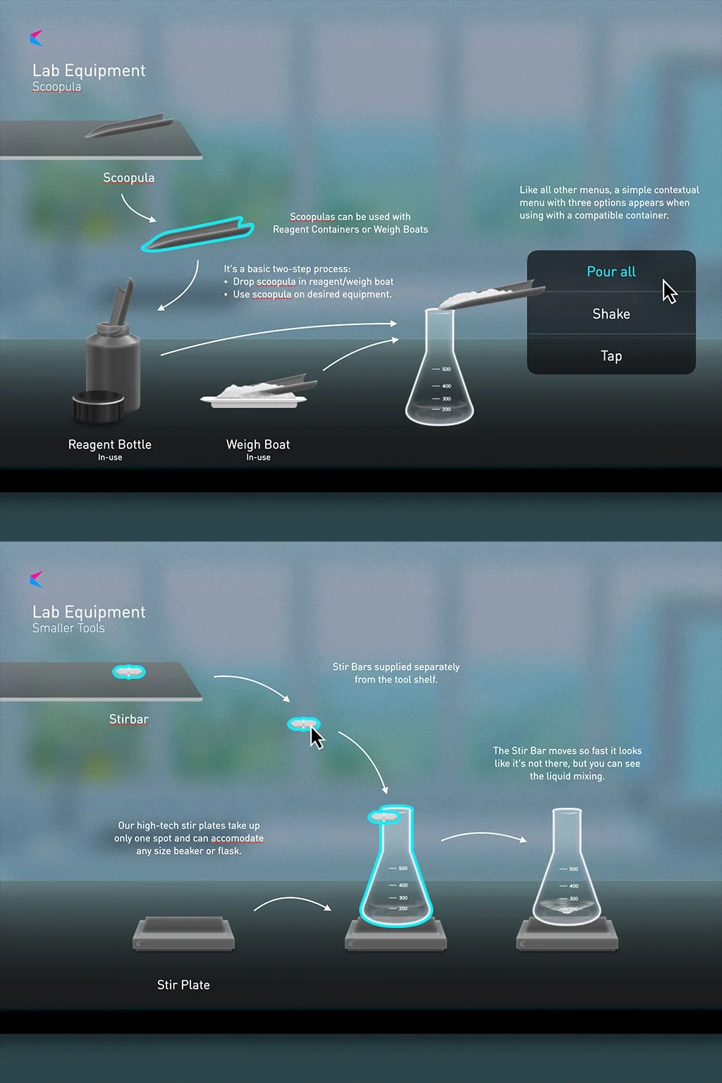
WetLabs Chemistry Simulator
UX + Visual Design for Smart Sparrow
Realistic chem-lab simulation
for biology and chemistry students
Problem
Real-world wetlabs are costly and inaccessible.
Ancient competitor references
Digital learning doesn't translate to chemlab knowledge
Lack of hands-on experience limits student progress.
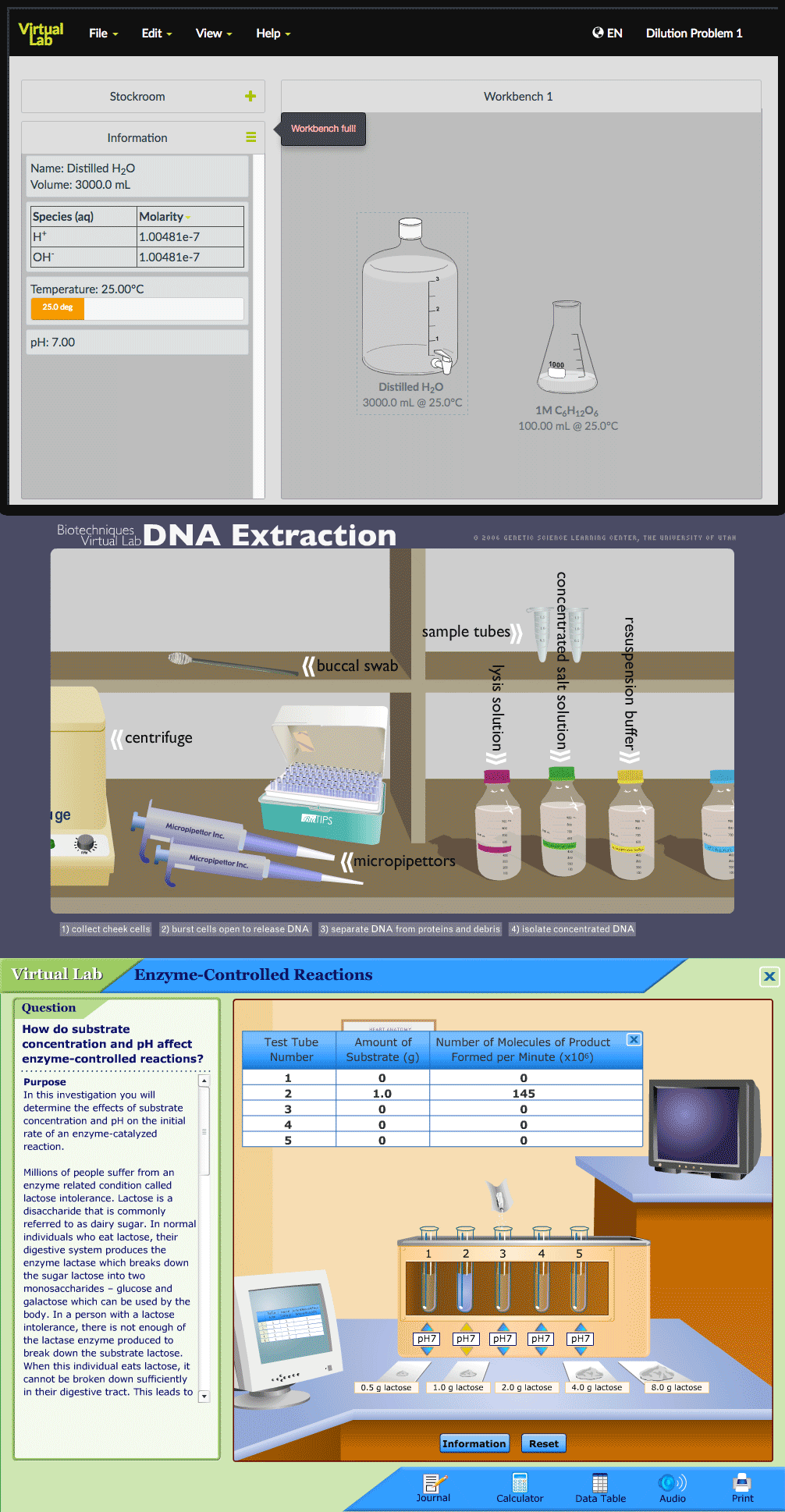
Constraints
Must be analogous to real labs for visuals clarity and trust
Must run fast on low-end student hardware.
Complex SVG scenes tanked performance
Design balanced fidelity, interactivity and feasibility.
Must run fast on low-end student hardware.
Complex SVG scenes tanked performance
Design balanced fidelity, interactivity and feasibility.
Approach
Photorealistic vector-based assets in Photoshop.
Organized asset library in Sketch for dev hand-off
Strict file discipline for easy reuse/composition
Prototype in SVG, pivot to PNG for performance
Organized asset library in Sketch for dev hand-off
Strict file discipline for easy reuse/composition
Prototype in SVG, pivot to PNG for performance
Lessons & Outcome
The Result:
In use at 3 institutions: Arizona State, Oregon State and University of Florida
- UX needs to balance fidelity with performance.
- Keep source of truth for distributed teams.
- Delivered performant, clear visuals and asset kit.
The Result:
In use at 3 institutions: Arizona State, Oregon State and University of Florida
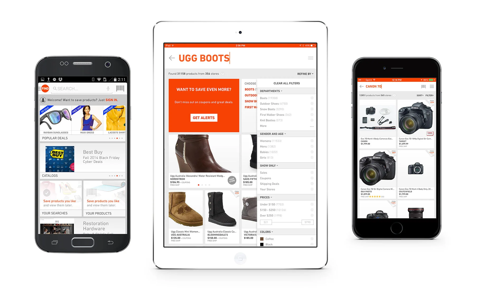
TheFind eCommerce Platform
(2012–2015)
Product Design, Brand Reinvention & Responsive Systems at Scale
Acquired by Facebook in 2015
Acquired by Facebook in 2015

Ecosystem
Company revenue relied on google search results
Bland results page falling out of favor
Rebrand commissioned from HUGE
App overhaul began to test the rebrand without affecting revenue.
Web overhaul would carefully take on app features.
App overhaul began to test the rebrand without affecting revenue.
Web overhaul would carefully take on app features.
Problem
Google search algorithm could kill traffic altogether.
Initial implementation of HUGE’S design in app killed reengagement.
Web user sessions short (under 2 mins), CTR receding.
And no retention features. Click in, click out.
Initial implementation of HUGE’S design in app killed reengagement.
Web user sessions short (under 2 mins), CTR receding.
And no retention features. Click in, click out.

Approach
Reskin HUGE style into something known to perform.
Dynamic user-first experience built on Elation framework.
Deeper item detail integration + Local shopping
User customization to increase user ownership
Mobile identity, infinite brand content infinite scroll
Dynamic user-first experience built on Elation framework.
Deeper item detail integration + Local shopping
User customization to increase user ownership
Mobile identity, infinite brand content infinite scroll
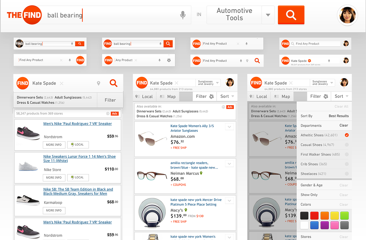
Outcome
- CTR up ~4% across key flows
- Average session length quadrupled.
- Small but loyal user base adopted
- Web redesign worked as a retention strategy
Lessons
- Reduce complexity
- Key on existing persona behaviors.
- Stay out of the user’s way
- Lively branding attracts attention.
- Multiply chances to engage.
