Browsers spearhead the extent of what’s possible for a website to do. If browsers were perfect, every website could be an app. Fortunately, the surge in mobile devices have put a modern high-powered browser in every consumer’s hands.
Due to browser limitations, the Viability of a true app-like experience on a mobile website was low until relatively recently.. Even now, the scope of what’s possible is limited by more than just the vision of what the product could or should be.
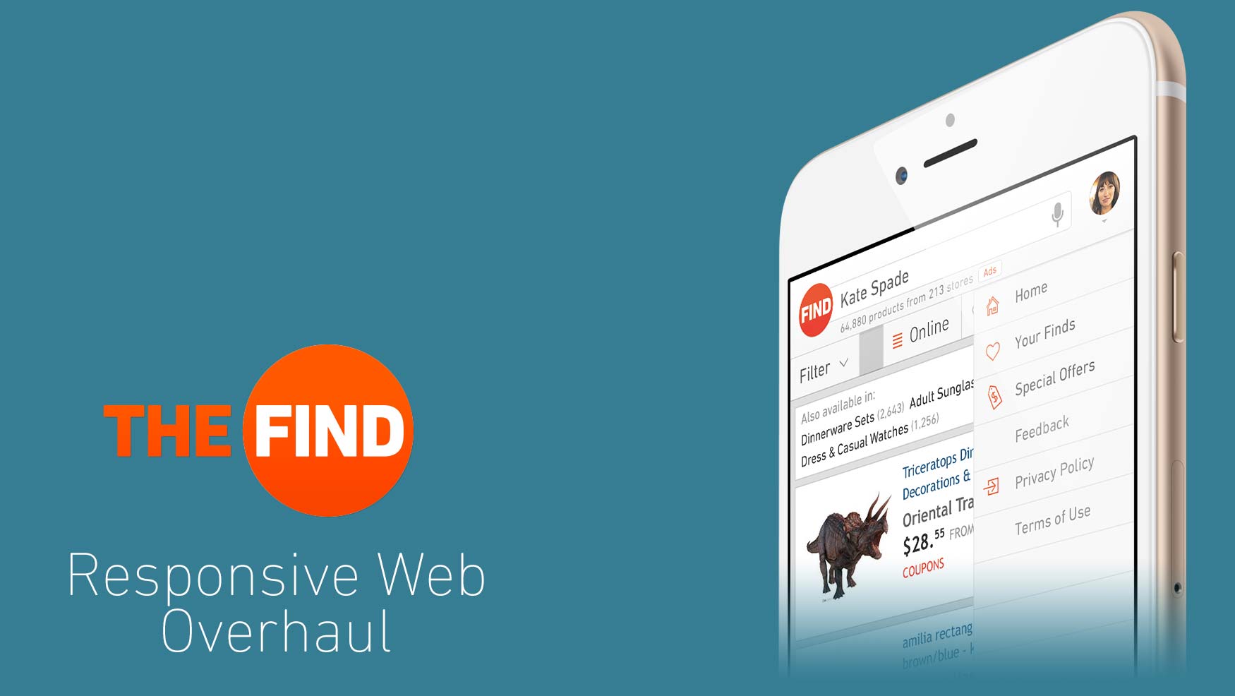
So while TheFind’s mobile experience gained more and more users, a native experience became integral to gather a more engaged audience; to step away from a simple utility for finding products conveniently to becoming a household name for all-things online shopping.
Communication is Key
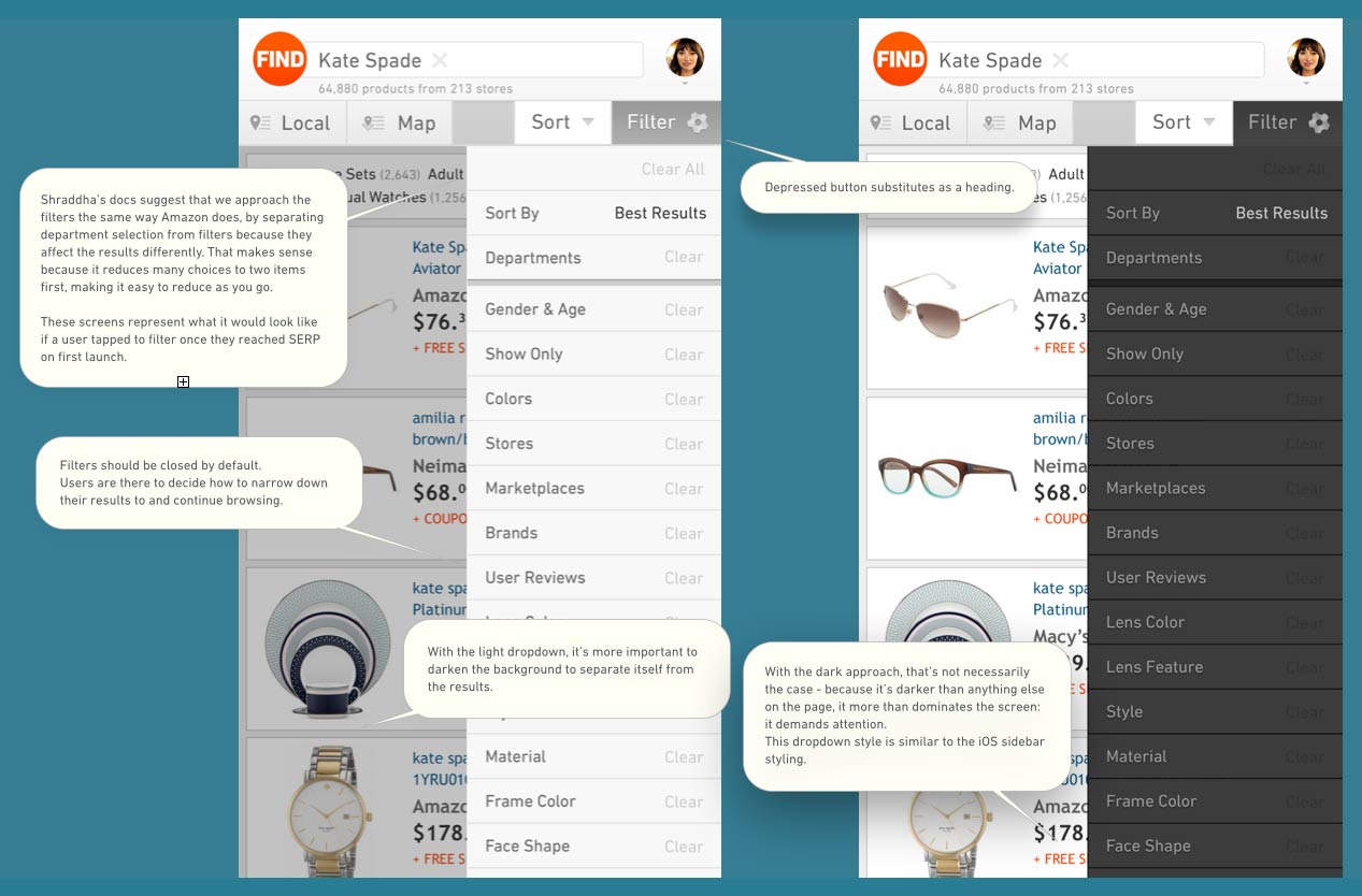
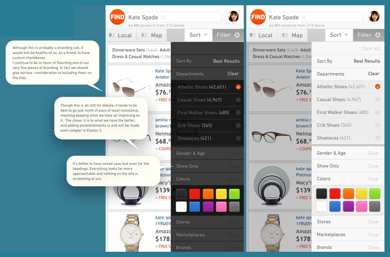
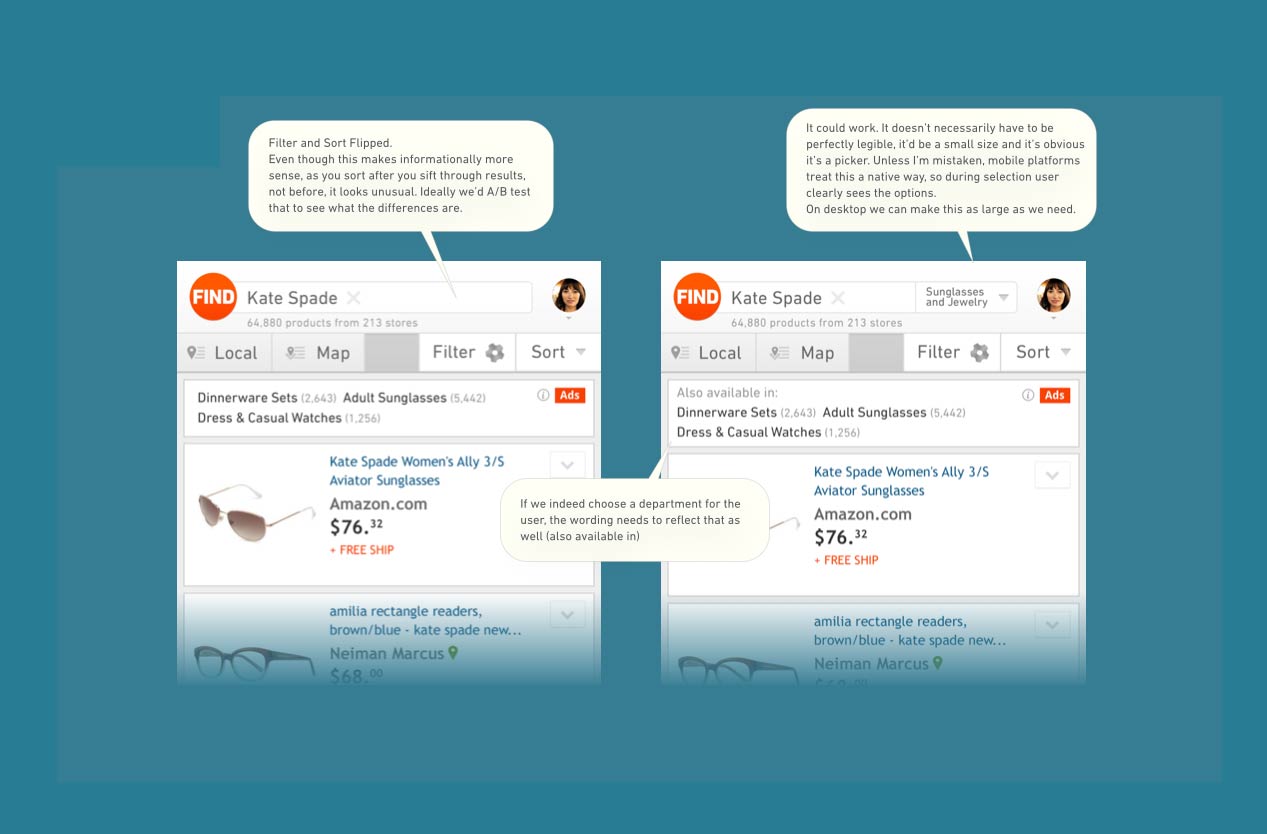
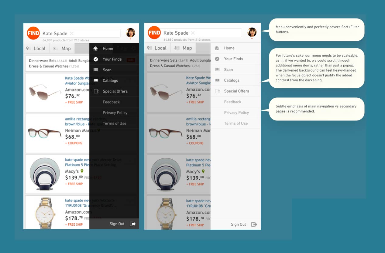
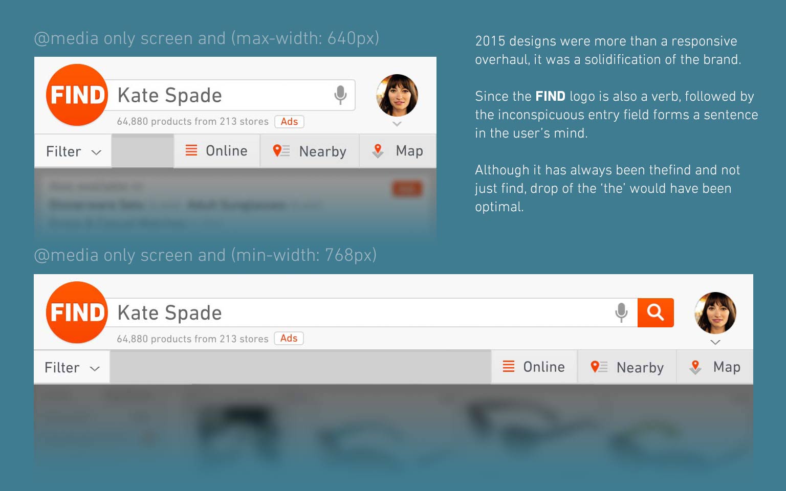
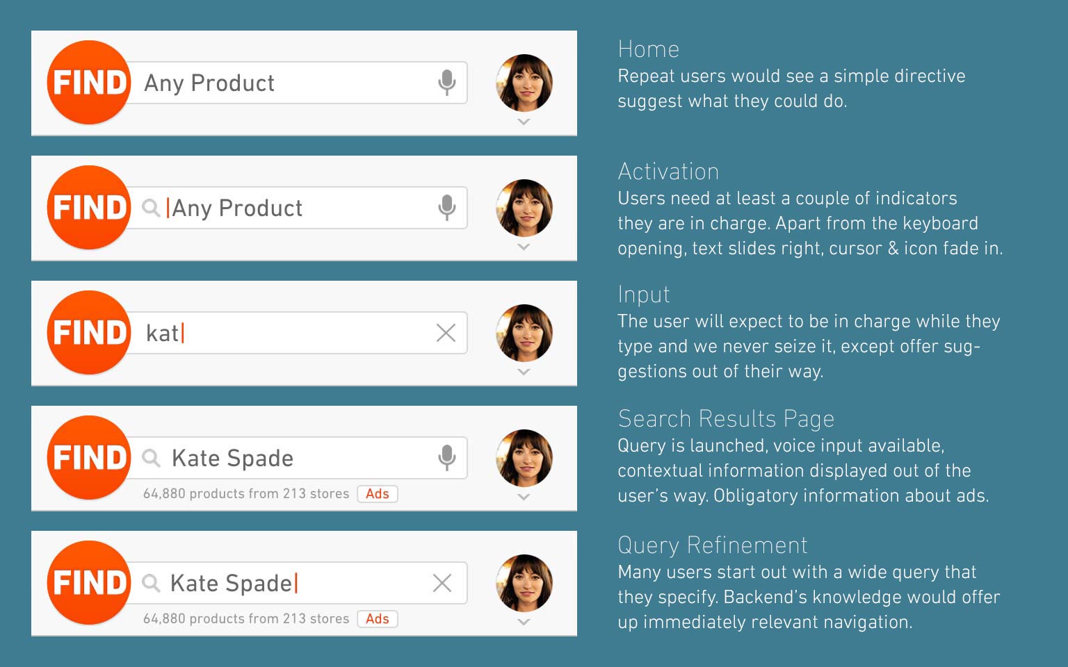
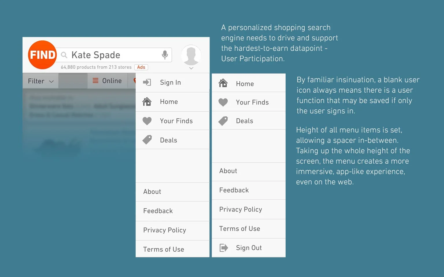
I like to combine UI and UX, because they affect each other in a symbiotic way. Because of this, the most efficient way to communicate ideas and feedback into designs is to keep a running set of mock-ups and annotate them properly to illustrate the design's intent as clearly as possible.
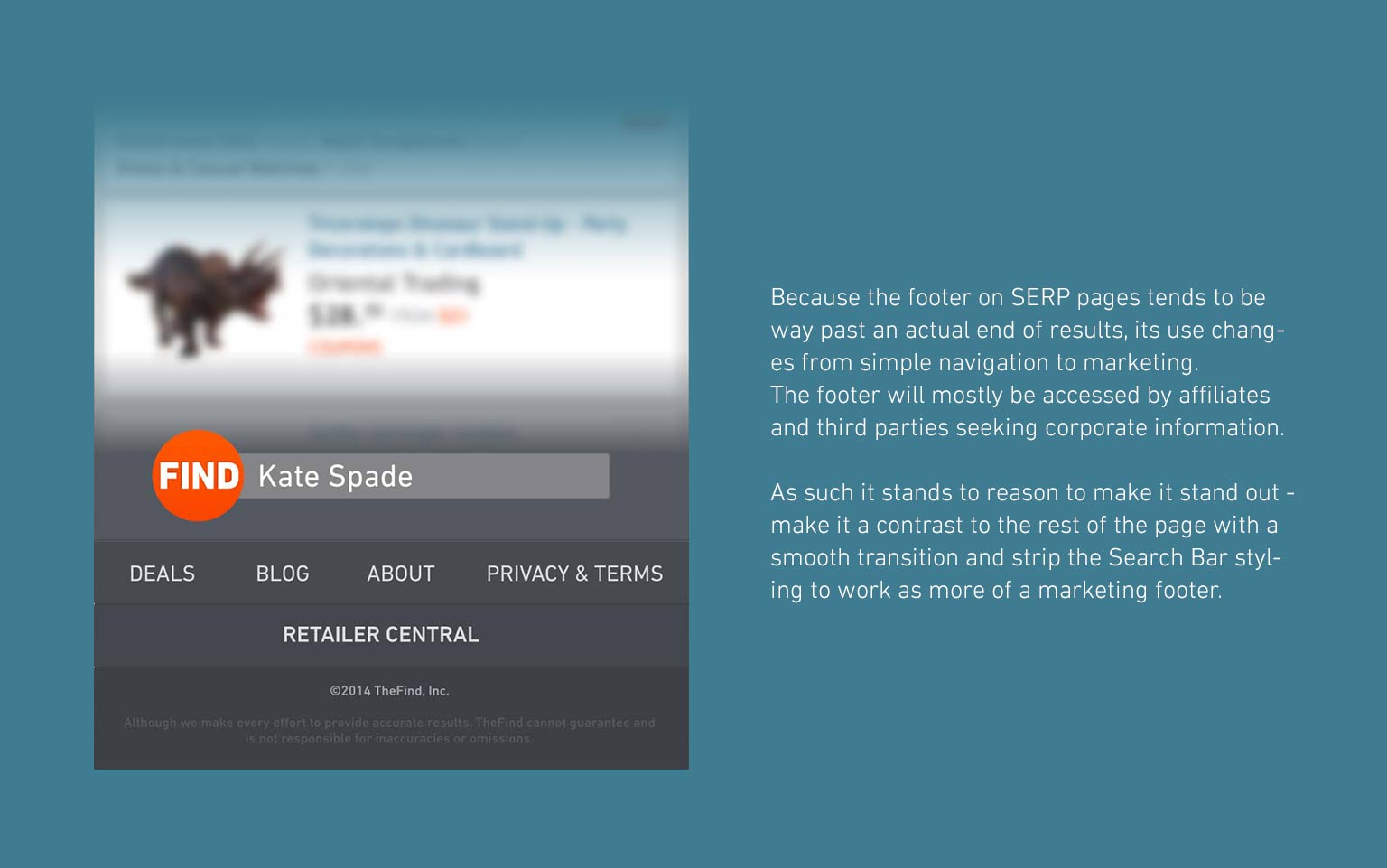
Below are several examples of interdepartmental PDF mail-outs regarding development and up-to-the-hour feedback incorporation.